Redesigning the anti-corruption INGO's website to help researchers, government officers and members of the civil society finding and understanding facts and data about corruption.
2023-2024 / Website, NGO, Non-profit
Background
Transparency International (TI) is a globally renowned organization dedicated to combating corruption and promoting transparency, accountability, and integrity at all levels of government, business, and civil society. Founded in 1993, the organization has built a strong reputation through its efforts to expose corruption and advocate for systemic reforms, earning widespread recognition for its impactful initiatives.
This case study highlights key moments of the redesign of TI’s website, for which I led the end-to-end design process, encompassing art direction, illustration, and interface design. The focus was on creating a visually compelling, usable and inclusive platform for a diverse, global audience.
The use case
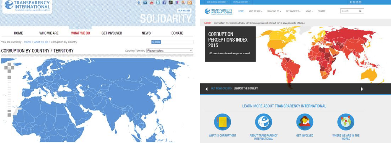
The redesign of Transparency International’s website addressed several critical challenges with its outdated predecessor. Originally launched over 15 years ago and partially updated in 2012, the old website was responsive for only 10% of its page content. This limitation made navigating the site on mobile devices frustrating and inefficient, providing a subpar user experience for an increasingly mobile-first audience.
Additionally, the website failed to comply with any accessibility guidelines, excluding users with disabilities and undermining the organization’s commitment to inclusivity. The need for an overhaul was evident, not just to modernize functionality but also to ensure that the site adhered to WCAG 2.1 Level AA.
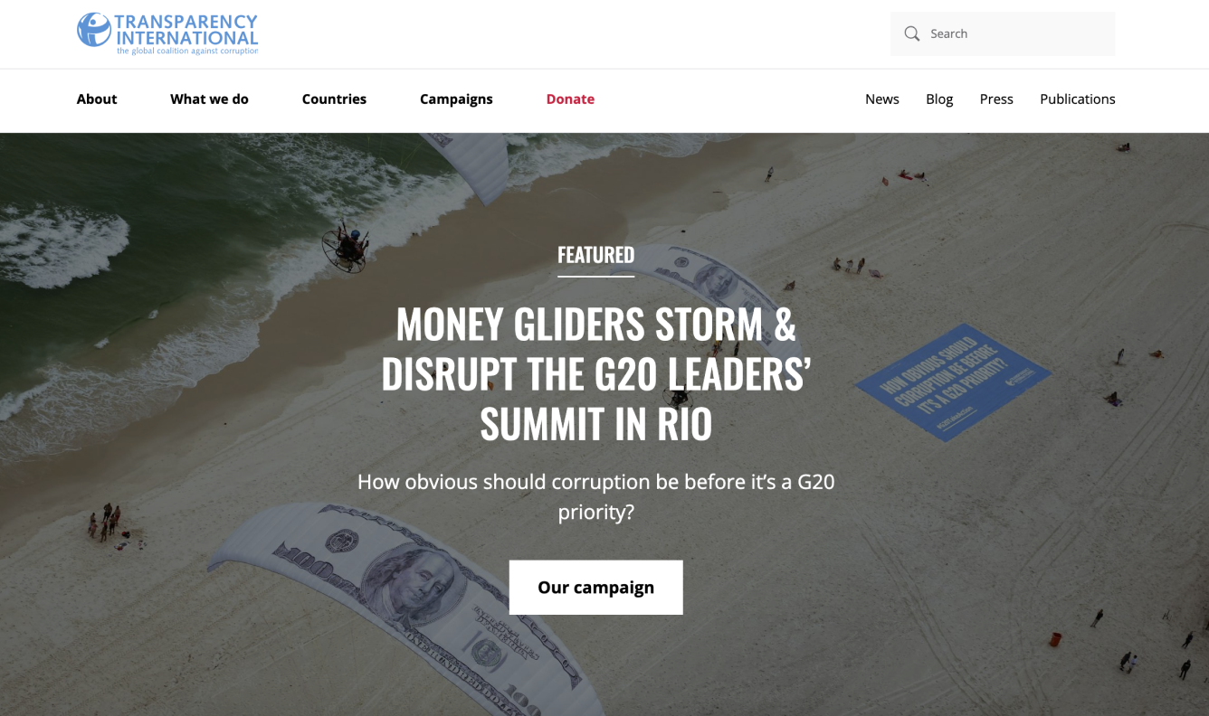
The redesign also presented an opportunity to refresh the website’s look and feel, aligning it with new visual guidelines that I created to reflect TI’s mission and values.
Discovery & research
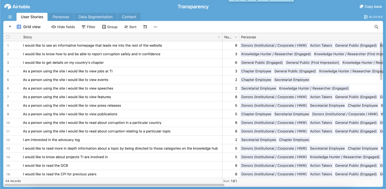
We began with a comprehensive discovery and research phase, combining quantitative and qualitative methods. We distributed a survey via Microsoft Forms to our mailing list, gathering insights into audience demographics, interests, and professions. The survey also explored what users liked and disliked about the old website, the content they found most engaging, and their expectations for the new design. This data provided a foundational understanding of our diverse user base and their needs.
Working collaboratively with the project manager and the development agency, we used Airtable to organize and analyze the findings. This process led to the creation of detailed personas, each assigned a priority level to reflect their importance in the redesign process. User journeys were developed to highlight pain points and identify key features needed to enhance navigation and improve the overall user experience. These insights shaped the requirements for a more intuitive and accessible platform.
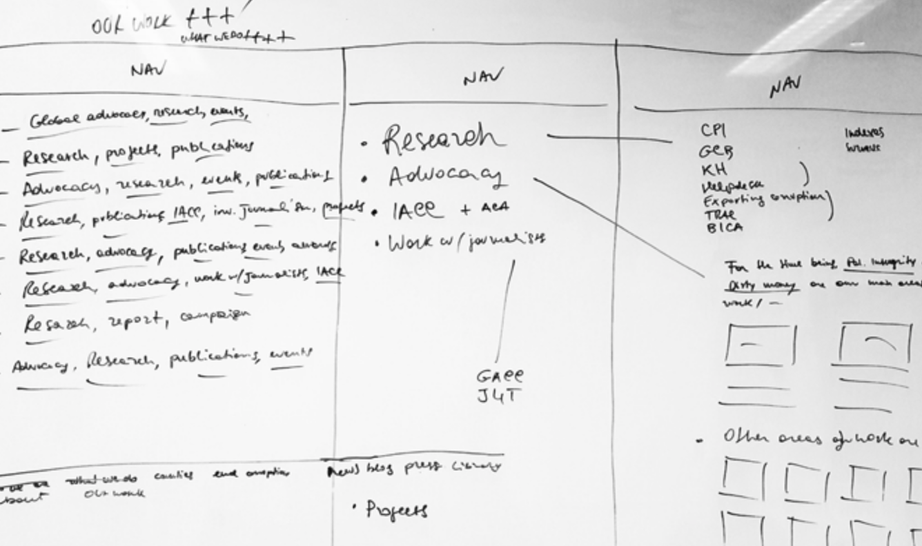
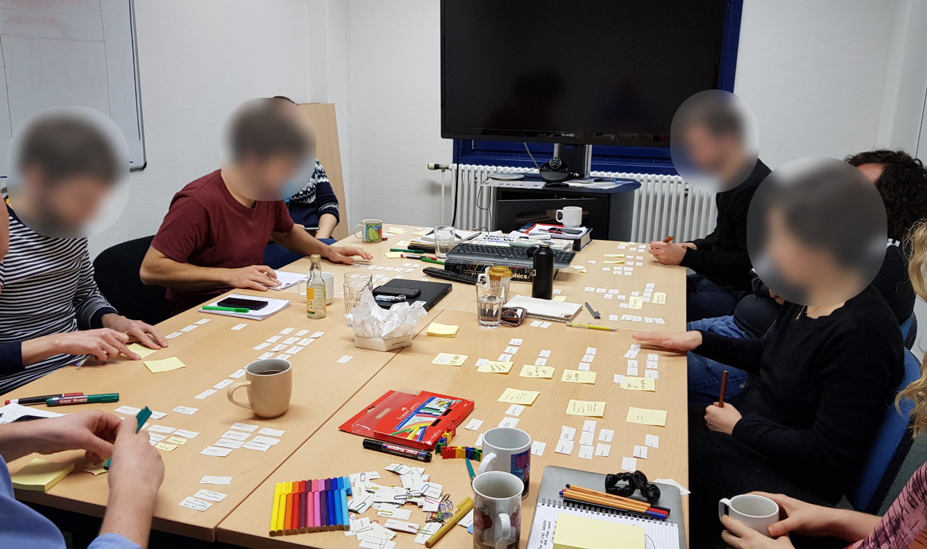
To refine the content hierarchy and improve information architecture, I facilitated focus groups and design workshops. Together, we redefined the sitemap and organized content into clearer segments.
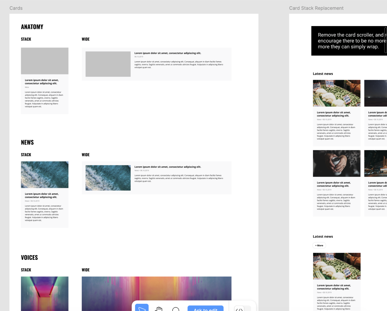
Design, prototype, test
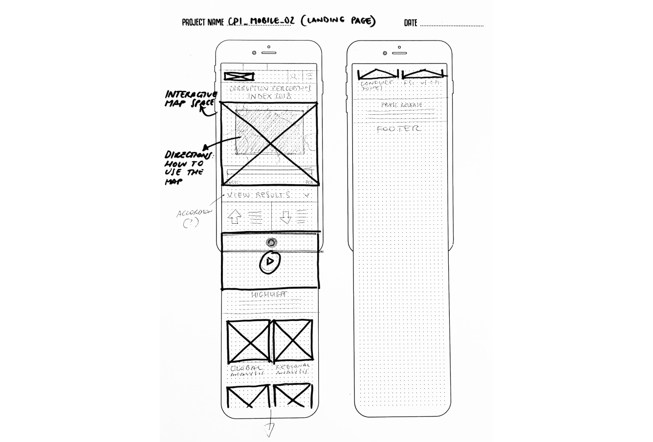
Building on this foundation, I created sketches and low-fidelity wireframes in Figma, which were reviewed and validated in stakeholder feedback sessions. To ensure usability, a functional prototype was developed in Axure RP and tested with several users, providing valuable input for the next phases of the redesign.
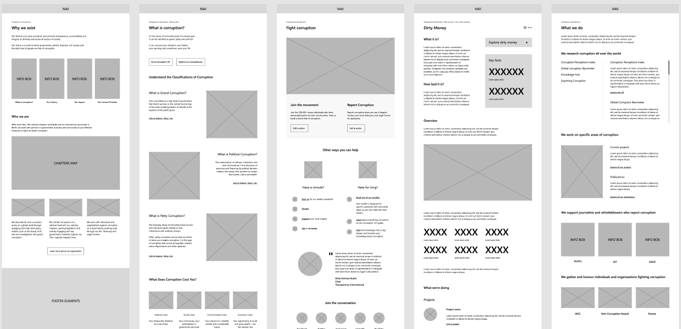
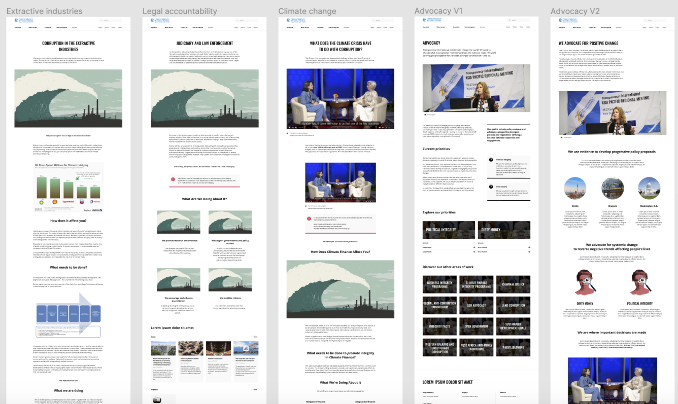
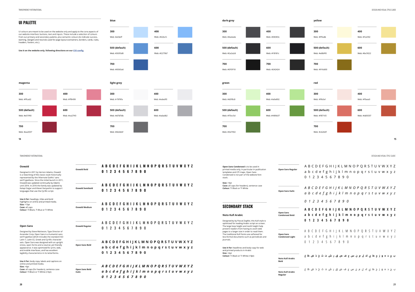
After the prototype and test phase, I assessed all the patterns and components of approved wireframes to create a big-picture design system for the new website. My blueprint established a fresh UI palette that integrated the primary and secondary palettes from the original visual guidelines and new icons and collateral illustrations, which followed TI’s original style.
Measuring success
The website redesign delivered significant improvements in user engagement, as reflected in the data collected through Plausible Analytics during the first six months post-launch. While we did not fully meet the ambitious goals we set, the results were strong enough to satisfy stakeholders and validate the redesign efforts. Comparing data from June to November 2020 to the same period in 2021, total page views increased by an impressive 183%, with mobile traffic up by 21% and desktop traffic showing substantial gains as well. The bounce rate saw a dramatic drop of 65%, indicating improved content relevance and usability.
Another key finding was the desire for a centralized, “one-stop-shop” solution that could integrate data from various sources, automate repetitive tasks, and provide actionable insights. Participants frequently highlighted the need for better visualization tools and dynamic data exploration features to help them make quicker, more informed decisions. These enhancements were viewed as essential for improving both individual productivity and team efficiency.
Time spent on page also surged by 210%, with mobile and desktop sessions increasing by 17% and 8%, respectively. Call-to-action (CTA) conversions saw a significant boost as well, rising by 51% overall—17% from mobile devices and 8% from desktop users. These metrics highlight the success of the redesign in making the website more engaging, accessible, and effective for users across platforms, even as we continue to refine and optimize the experience further.