Designing a BI platform to help municipality officers integrating, transforming and visualising government data for data-driven decision making.
2023-2024 / Cloud-based web application, B2B, SaaS
Background
Polyteia began as a data service providing German municipalities with a comprehensive data analysis solution. By aggregating, transforming, and analyzing data from various sources — such as Excel files, administrative software, and databases — the company delivered insights through a user-friendly dashboard, empowering municipalities to make data-driven decisions.
This case study highlights key moments in the journey of evolving Polyteia’s flagship product from a read-only dashboard into a fully integrated, browser-based BI platform. I played a leading role in the research and design efforts, while also contributing to the overall product strategy and management.
Discovery & research
Our decision to develop a Business Intelligence (BI) tool was driven by valuable feedback from internal analysts, customer success teams, sales representatives, and our clients. From the outset, it was evident that our data platform needed to encompass the entire data workflow—covering everything from data ingestion, transformation, and pipeline orchestration to analysis and report creation—within a single platform.
To gain a deep understanding of the processes, technologies, and tools involved, I began by interviewing data engineers and analysts. These interviews provided valuable insights into the existing workflows and the challenges they faced, such as using multiple tools for different tasks. I learned about the specific technologies we employed and the intricacies of the tasks that needed to be streamlined.
In addition to these interviews, I conducted extensive desk research to familiarize myself with the fundamentals of data engineering. I also took the initiative to learn essential tools like SQL and dbt, which allowed me to better grasp the technical aspects of the workflows I was aiming to optimize.
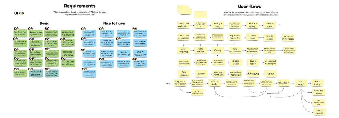
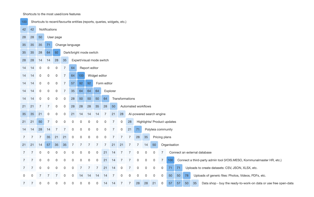
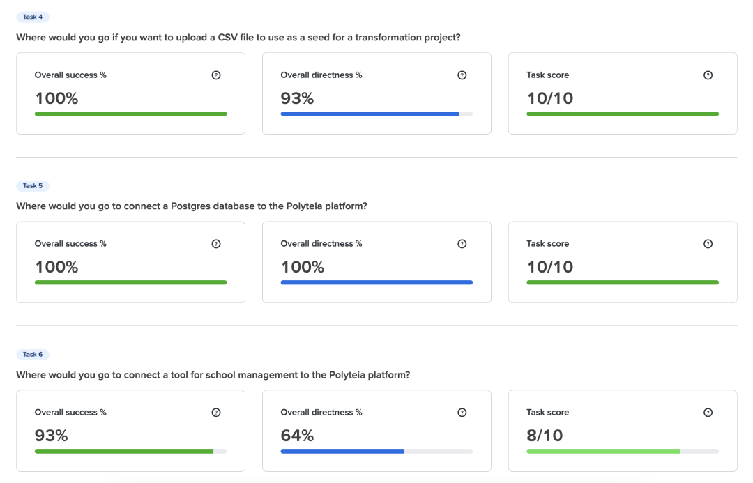
Using the insights gathered from the interviews, I created and tested user flows to ensure that our proposed solution met the needs of our users. To further refine the platform’s structure, I conducted card sorting and tree testing workshops through Optimal Workshop.
Design, prototype, test
We embraced a collaborative approach throughout the design process. I conducted co-design sessions, bringing together diverse perspectives from data engineers, analysts, and other stakeholders.
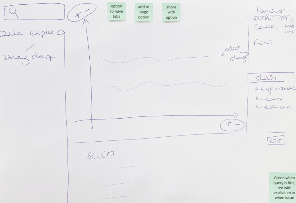
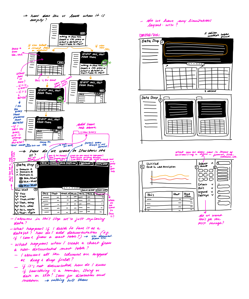
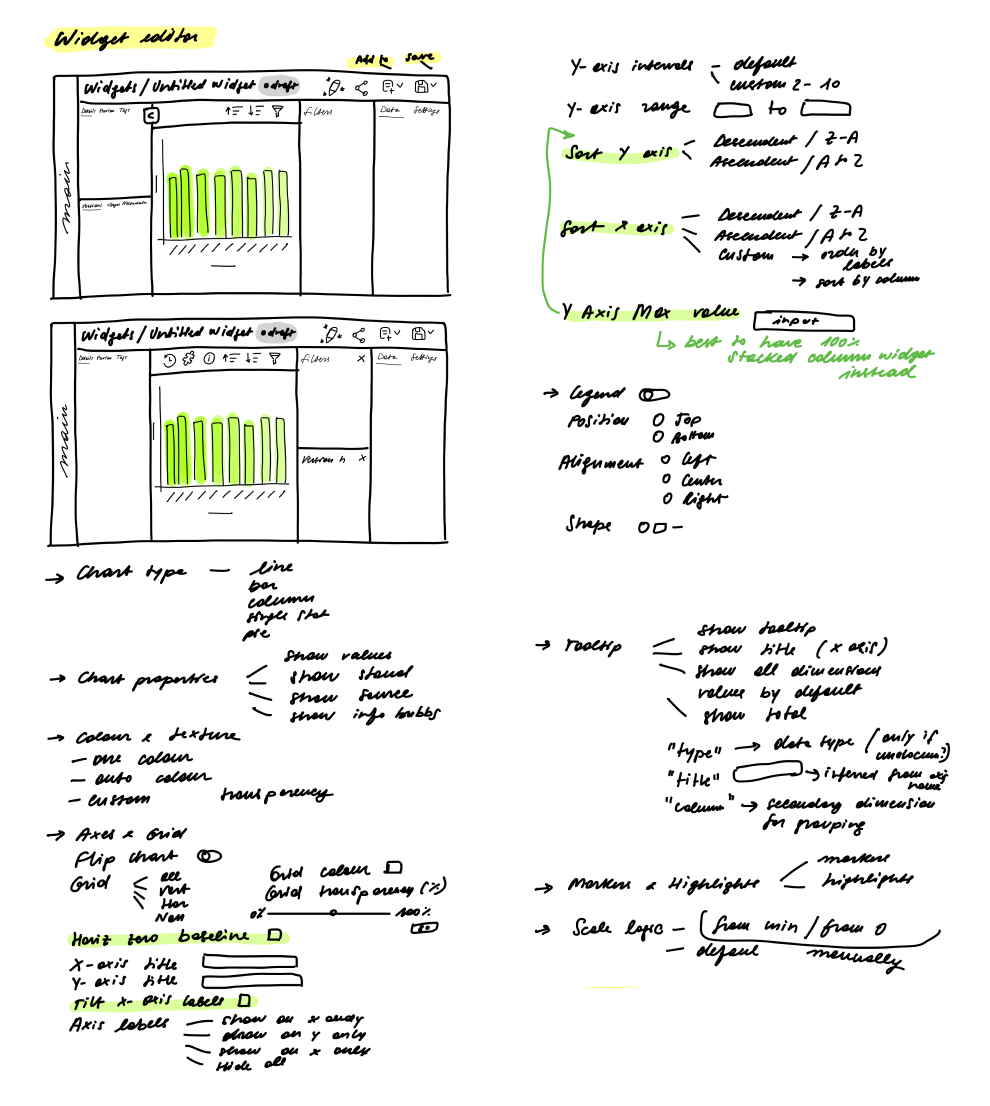
Before moving to high-fidelity prototypes in Figma, we spent significant time sketching and creating paper prototypes. This hands-on approach allowed us to quickly iterate on ideas, identify potential issues, and gather feedback early in the process. By exploring different design solutions on paper first, we were able to focus on the core functionality and user experience without getting bogged down in the finer details too soon.
Once we felt confident in the direction we were heading, we transitioned to Figma for creating high-fidelity prototypes. This shift allowed us to bring our designs to life, incorporating the feedback and insights gathered from our earlier sketches and co-design sessions.
Especially when working on complex applications for expert users, I believe that a designer’s role is not always to be in the driver’s seat. Technical users possess deep knowledge of processes and tools, and more experienced individuals often have insights into the history behind these systems—how they have evolved, why changes were made, and whether those changes were improvements.
This knowledge is invaluable, and I believe the designer’s role is to harness and amplify it, enabling these insights to shape the design. While the designer may still own the process, leading it is not always necessary; instead, facilitating and highlighting the expertise of others can often lead to a more effective and user-centered outcome.
UX highlights
My UX approach for the data platform was guided by a few core principles that ensured I created an intuitive, accessible, and effective platform for all users.
Making Complex Things Simple: One of our main goals was to simplify the complexity inherent in data workflows. We focused on streamlining the user experience, distilling complicated processes into straightforward, manageable tasks.
Don’t Reinvent the Wheel: We recognized the value in leveraging existing solutions and familiar tools. Rather than creating new, unfamiliar interfaces, we drew from established patterns which our users already knew and trusted.
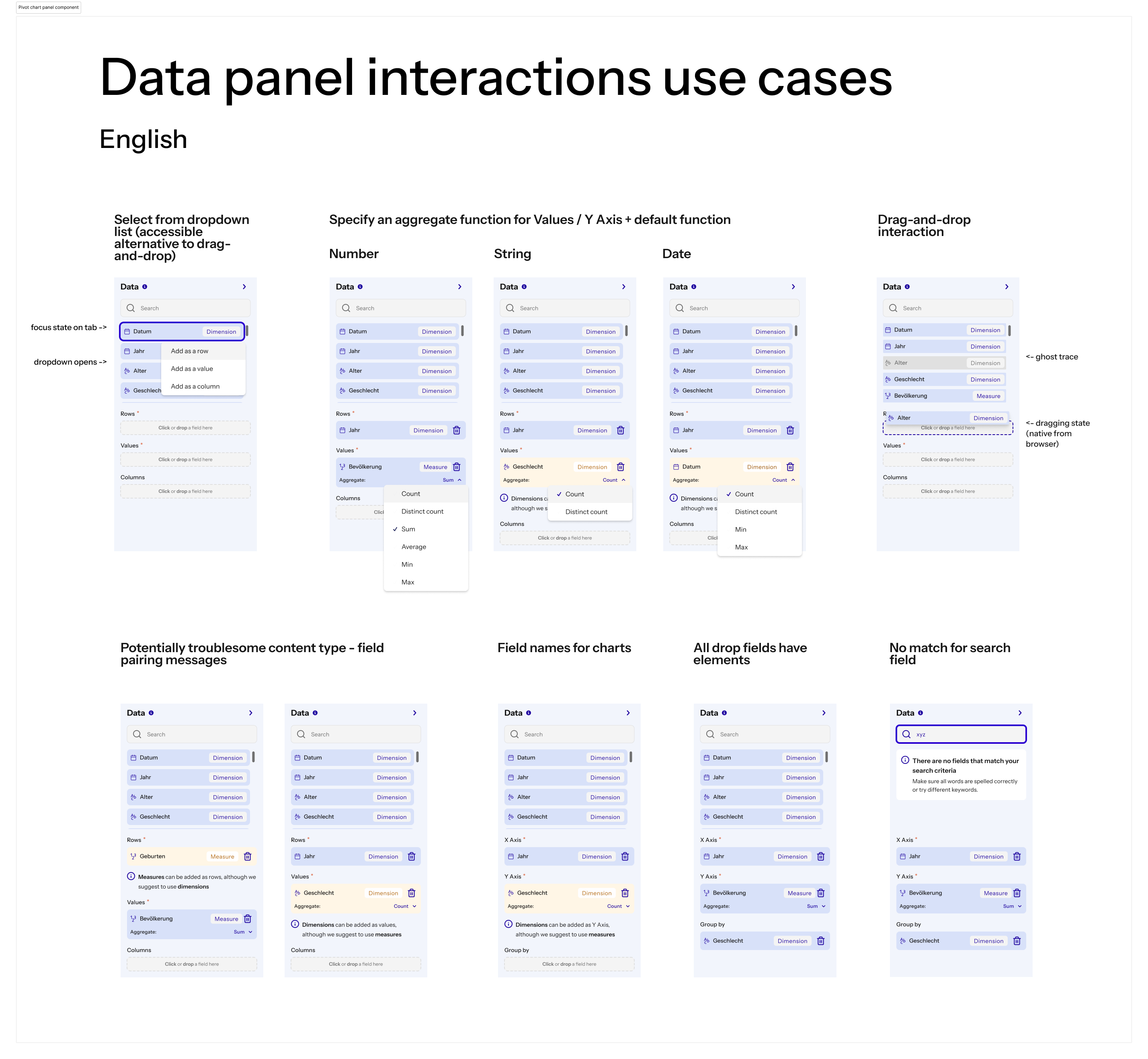
Prioritise Accessibility: Accessibility was a top priority throughout the design process. I ensured that the tool was usable by a diverse range of users, regardless of their technical expertise or physical abilities. This included considering color contrast, keyboard navigation, and screen reader compatibility.
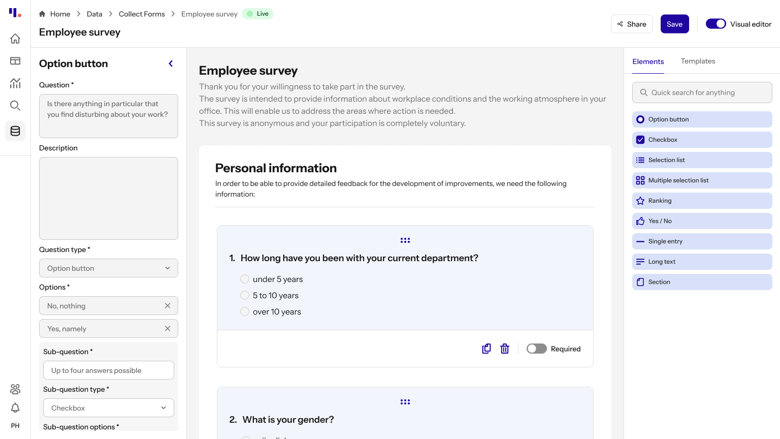
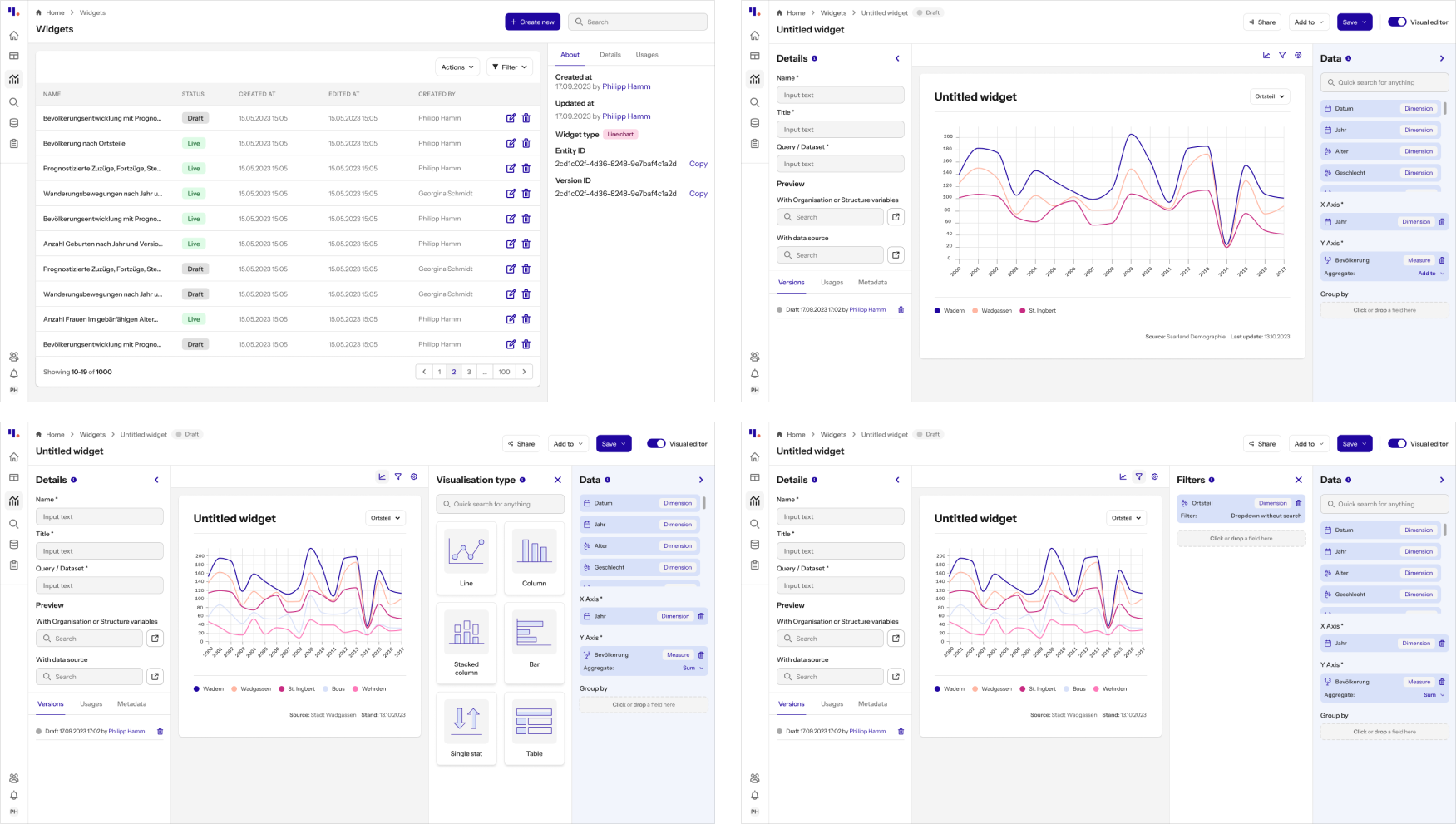
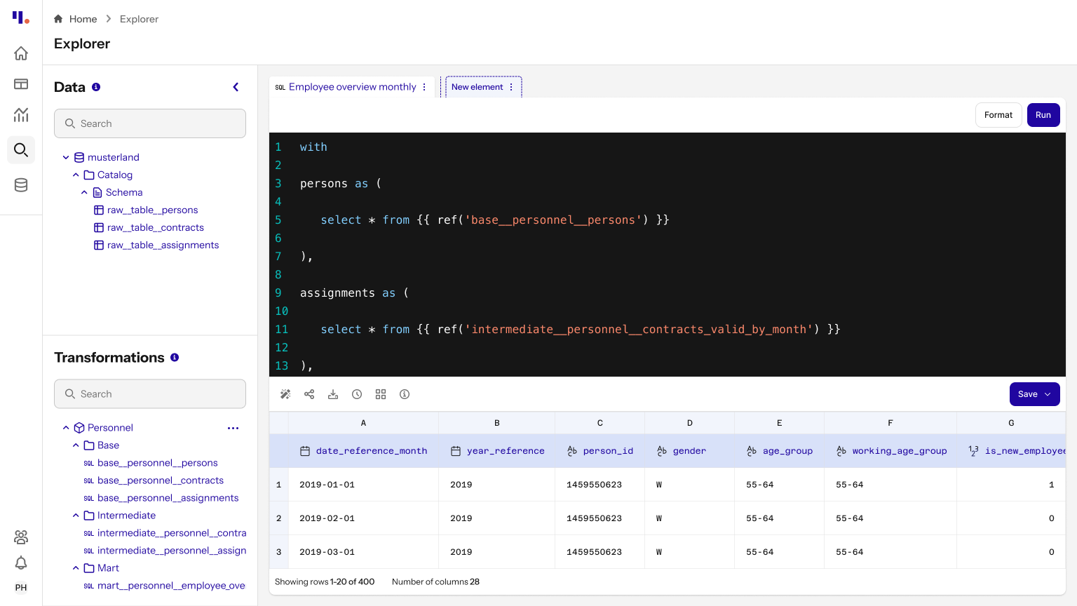
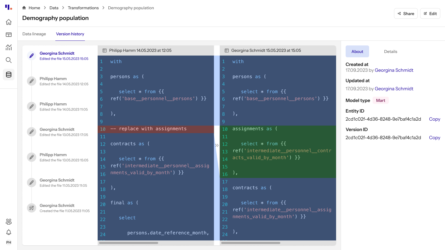
Scale the Experience According to User Literacy: Understanding that our users had varying levels of data literacy, I designed the platform to scale according to their needs. For municipal officers with less technical experience, we offered a simple, no-code interface that allowed them to perform tasks without diving into the complexities of data manipulation. At the same time, we provided advanced features, like the ability to write SQL and JSON, for expert users who required more control and flexibility in their work.
UI highlights
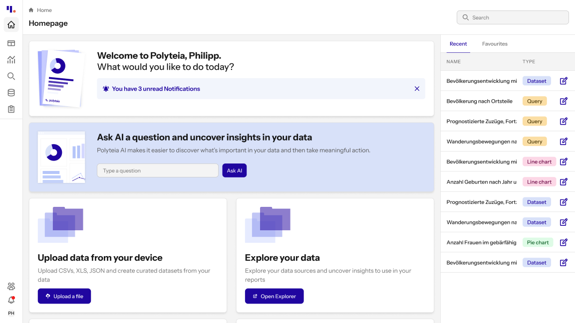
To facilitate ease of use, I incorporated well-known dashboard patterns throughout the interface. These familiar layouts and components helped users quickly understand and navigate the tool, minimizing the learning curve and allowing them to focus on their tasks.
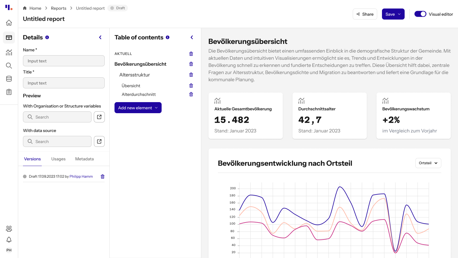
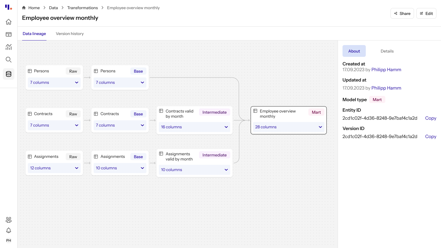
Besides, I intentionally reused patterns across different sections of the platform, ensuring that users would encounter familiar layouts and interactions regardless of the task they were performing. For example, our multi-panel layout was designed to be versatile, serving as the foundation for various tools within the platform, including the data explorer, report editor, form editor, and widget editor. This consistency not only created a unified visual experience but also helped users seamlessly transition between different tasks without needing to relearn the interface.
Finally, to align the UI with our rebranded style guide, I updated our existing design system, refreshing components and visual elements to reflect the new brand identity. In addition, I incorporated components from the Flowbite library, enhancing our design system while cutting down on design and development time. This allowed us to deliver a polished, cohesive interface more efficiently, while also improving the overall quality and functionality of the UI.